
Color: A Description (cartoonist types may want to skip this part)
One of my jobs as part of the Edison Lee production team is to do all the Photoshop color for the strips. Well, ninety percent of the color - we'll get to that in a minute*. This is a big job because, unlike the old days where only Sunday strips were in color, all the dailies are as well, and John's art for the strip tends to be pretty complex. I also choose to make this process a little more difficult by treating dailies with the same color complexity as Sundays. Also, I have to do color that looks good both in print and on the web.
One may wonder, "What's the difference?".
The biggest challenge for creating color for print is registration. I imagine you have encountered registration problems in your paper - it is usually most obvious when they run a color photograph and the color is skewed from the black and white part of the photo. In the printing world all colors are lined up and printed one at a time. If any of these layers are not properly lined up using registration marks, the resulting image has the layers in different places. Or the paper shifts while it is on the press. In the comics, especially if the detail is very fine, this can be a disaster, rendering a comic almost illegible. Our local paper runs all their dailies in color so I was able to see this happening and come up with a system of coloring which would minimize the effects of bad registration.
One of the challenges in coloring for the web is that I can't use RGB color, but must use CMYK. For those who don't know the difference between the two, RGB is for computers and other screens and CMYK is for print. Since papers can only use CMYK and we can't send two different files to the syndicate, we are stuck with it. Another thing about comics on a computer screen
is that they will have light behind them. (think lite brite here) The way light alters color varies from computer to computer and even differs depending on the angle at which you look at your screen. If you have a screen that tilts to various angles, try changing the angle and look at what it does to the color on this page. As I have changed from one computer to another, I have learned to work from a set group of swatches as I cannot always trust the color I am seeing. Finally, something seems to happen with airbrushing and gradients after I ship these off to the production company. The colors "scatter" in an almost freckle like way so that the airbrushing no longer looks smooth. I suspect the media company that preps the strip for papers changes the file in a way that works well for print but changes the look of the strip on the web. I have noticed this in other people's strips as well and it is doubtful this can be changed.
So, providing color every week is a big job but I love it. As I had never worked in Photoshop before I began coloring the strip, I had a pretty steep learning curve and my thanks go out to John for his patience while teaching me the ropes. Also thanks to Alyssa Abraham who was John's coloring assistant for the first 12 weeks after the launch. Alyssa was part of the intern program at one of our local colleges and the semester she worked for John was crucial to the transition into papers.
Color Challenges
So, occasionally John gives me something like this:
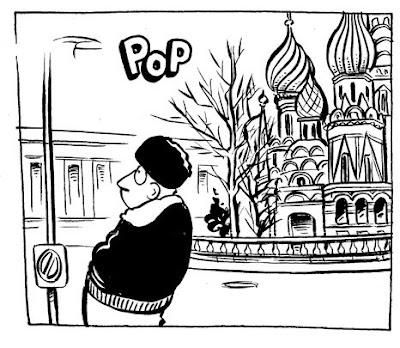
And I think to myself, "St. Basil's?! All the iconic images in the world and he picks St. Basil's?" The rest of my thoughts will remain censored. He gave me this particular strip two weeks before Christmas. Now, I don't know what your December looks like, but mine is crazy. In my other life I am a freelance musician and Christmas is, hands down, my busiest time of year. Ugh! To be fair here, I should mention that - while I had to color St. Basil's - John first had to draw St. Basil's - something I consider to be no small feat.
So I buckled down to it, using a rather dark and grainy photo of St. Basil's as my guide. Generally I do the color out of my head but sometimes, as in this case, I have a certain amount of accuracy to maintain. At that point I try to get a photo for reference. Often John will use one himself for the drawing and then pass it on to me. The problem with working from these photos is that I generally color at night - it's the time that fits best with the rest of my schedule - but the colors on the photo are completely different in artificial light. Especially the very bad artificial light in the room where I keep the computer. This time I opted to do about half of it that first night and then wait until morning to check my accuracy in daylight, completing it with better light. Ironically, 2 weeks after completing the strip, I discovered a beautiful, full color, large picture of St. Basil's on the cover of a jigsaw puzzle box in my basement. Such is life.
Anyway, here is the finished cathedral:

And here is the full strip closer to the actual size that it ran on the web and in papers. **
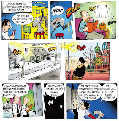
I was a little disappointed at how much detail is lost as it shrinks but I have learned to expect that. I still work very large when coloring and try to put in even small details. You just never know when someone is going to take your work and blow it up to giant size to scrutinize it.
As you can see, other parts of the strip were also complicated but much more the sort of thing I often have to deal with. I confess I did everything but the cathedral first. (I also tend to eat my vegetables last.)
*About the ninety percent thing - sometimes we get behind and John colors a strip or two (the seriously motivated may be able to tell whose are whose) - and on this strip he added the lightning effect. As I am still learning about Photoshop all the time, and he is an old hand at it, he sometimes goes in and adds special effects that I haven't yet mastered.
**I had to have John rearrange the panels so they would fit into this blog format.

No comments:
Post a Comment